I recently hit a few lucky numbers in the internet lottery and wound up with the #5 post on Product Hunt. This was my first experience posting on Product Hunt and, I will admit, I was nervous. The novelty of putting a price tag on my creative work has most definitely not worn off yet.
So, for all those first time Product Hunters, this post is for you.
In section 1, I review what Product Hunt is and why founders and makers obsess over it.
In section 2, I break down exactly what I did to prepare for my Product Hunt launch. Plus, screenshots and a free Figma template for creating your product imagery.
In section 3, I discuss what happened as a result of my product getting to #5 on Product Hunt. This includes the performance of my post and resulting web traffic and sales as well as other things that no one tells you about launching on Product Hunt:
- Sketchy email and Twitter DM scams
- Invitations to SAAS products
- Getting featured in the Product Hunt newsletter
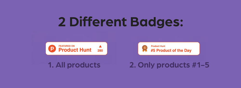
- Badges for your website (two different types)
- Racking up "karma" points
- Earning a maker label on your comments and a green M on your profile
The last thing I'll say before we dive into preparation is that I don't recommend obsessing over your Product Hunt launch. All in, my thinking, designing, creating and writing for the launch didn't take more than several hours. Remember, the internet is a fickle place. There are too many factors to kid yourself into thinking you can engineer the "perfect launch". And you simply can't control when other epic product makers like yourself will post to Product Hunt. Competition is fierce!
All that being said, a little preparation doesn't hurt. So let's get into what I did in the run-up to my scheduled Product Hunt launch.
But first...
Section 1 - What is Product Hunt?
Product Hunt is a website for launching and discovering new products. It's widely regarded as the place entrepreneurs go to introduce their products to the world. In fact, it racks up on the order of 10m views per month!
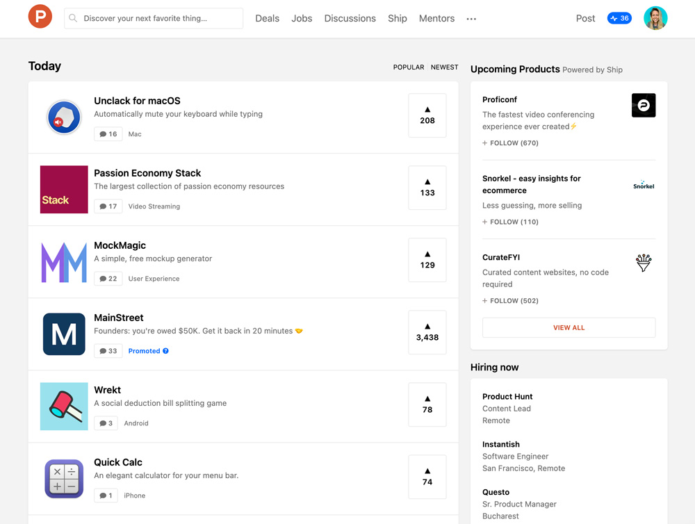
Every day, dozens of new products are submitted (for free) – either by their maker directly or by other Product Hunt community members. Users then have 24 hours to vote and comment on their favorite products for the day, which move up and down the leaderboard based on a popularity algorithm. The higher your product is on the leaderboard, the more visibility and referral traffic it will receive. Only the top dozen or so products are shown on the homepage.
There are a number of benefits to posting on Product Hunt:
- Traffic and sales: Users can click "Get It" to view, purchase or sign up for your product. For popular products, this results in a huge spike of traffic to your website or download page.
- New users: Product Hunt users are early adopters; they enjoy trying new products, even if there are bugs or limited features. When they find something they like, they share their experiences with their network.
- Refinement: Product Hunt posts require high quality imagery and concise wording. Once you've created this content, you'll be able to re-use it across other channels in the future.
- Feedback: Users can comment and ask questions. This can help you to refine your value proposition and makes your product stronger.
- Media coverage: If you're really lucky, you might even get picked up by the press.
If launching on Product Hunt is so great, you might be wondering whether you can launch repeatedly, say, every month. Short answer: no.
Product Hunt requires at least six months between posts as well as significant updates to your product (ex: the launch of an app, a major redesign etc.)
The two-posts-per-year limit makes it even more important that you do everything in your power to make these posts count. Which leads us to...
Section 2 - Preparing for Your Product Hunt Launch
Research
Before creating the post for your product, browse Product Hunt for other products within the same niche. So in the case of my product (Notion icons and cover images), I researched other icon packs and Notion templates.
The point of this exercise is to compare products that did well with products that didn't do as well. As you browse, ask yourself:
- Are there any consistent themes amongst the successful products?
- Are there any reoccurring words in successful product titles or descriptions?
In my niche, I noticed that successful products:
- Emphasized aesthetics, customization and minimalism
- Specifically mentioned exactly what was included (ex: 120 icons, lifetime updates, 6 themes, etc.)
- Used visually appealing product imagery
- Were accompanied by personable first comments from the makers
These were important factors to include in my product post.
Creating the Post
After about half an hour of research, I switched gears and started to create my product page. This page contains all of the information and imagery that users will see when they click on your product. It includes:
Let's look at each of these sections in more detail.
First, the title:
You should probably already know the title of your product. But, in case you're thinking about adding an extra word, it's probably best if you don't. Keep your title short, no emoji.
Next, the tagline:
Describe what your product does, 60 characters max.
The tagline appears under the name of your product on search result pages. Per Product Hunt recommendations, avoid slogans, cliches or jargon. Optimize for search phrases; you want your product to be discoverable.
Next, the thumbnail:
Because it's a 240x240 square, real estate is limited. My idea was to create an animated gif to showcase a handful of the icons included in the pack, rather than showing a static thumbnail with only one of the icons.
I am not an animation wizard. But I was able to use the timeline feature in Photoshop to create a very basic gif with rotating icons.
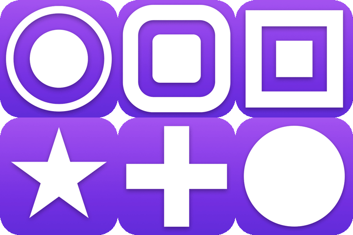
Is creating a gif worth the extra effort? I think so. You'll notice on the Product Hunt homepage that the products that stand out the most are the ones that catch the eye, either with movement or changes in color.
If you're in need of inspiration, check out this collection of the best "explainer" thumbnail gifs.
Next, the imagery:
The gallery is where you show off your product. Most of the posts in my niche had at least four visually appealing images or mockups. So I knew I had to shoot for at least that many.
Using Figma, a free design tool, I created seven product images to showcase my icons. From my research, I knew that it would be important to display my product "in the wild". So, in two of my images, I included real (enlarged) screenshots of Notion pages with icons.
I also included a short value proposition in each image. For example, "create aesthetic Notion pages" and "draw attention to important pages".
Finally, the last image included a preview of all of the icons along with the promise of "more icons on the way!", which makes the pack more enticing.
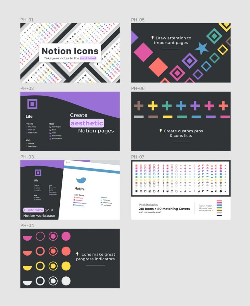
I will say that I was at an advantage when creating my images because my icon pack is very colorful and eye-catching to begin with. If your product isn't as visual, I'd use as many screenshots as you can, with colorful titles and callouts. A video introduction or walkthrough can also be powerful.
To help you get started, I've created a Figma template pre-loaded with artboards of the correct size for Product Hunt thumbnails and gallery images. If you don't already have one, you can create a free Figma account and then duplicate the template to use for your imagery.
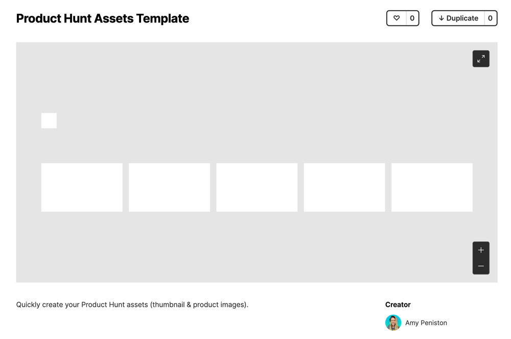
One last thing to keep in mind when creating your images: your first image will be the one that is shared on social media. So, try to make it as "shareable" as possible.
Next, the description:
One thing that surprised me during the research phase was just how short almost all product descriptions were. The official Product Hunt guidelines suggest 1-2 sentences at most, the shorter and clearer the better. So, cut the crap, describe your product (no lingo) and what the value proposition is for users.
The description appears under the gallery of product images. Note that you can include line breaks, so be sure to check the preview in case you have a sentence that is breaking in a weird place. It might look better to push that sentence to a new line.
For example, below is a preview of my product description; the second sentence has been forced to a new line.

Next, the first comment aka the maker comment:
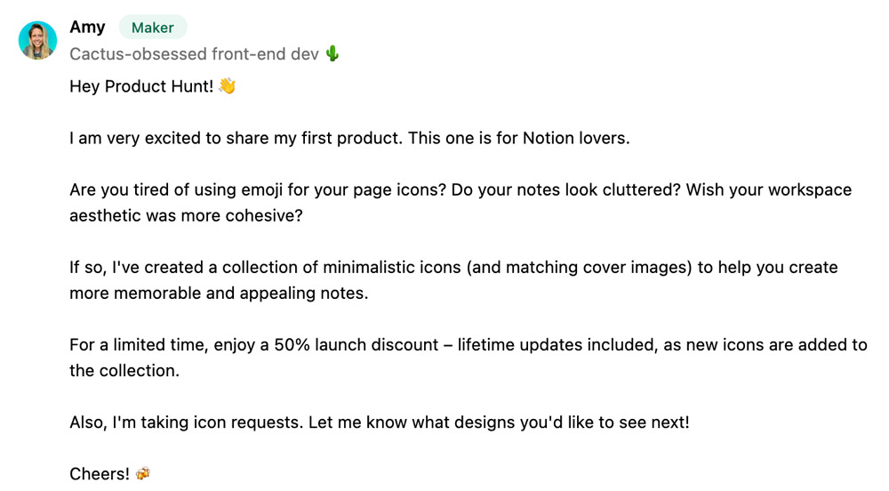
In almost all of the products in my niche, the maker left a personable comment to introduce, explain and call to action. Here's a structure you can follow:
- Start with a greeting, emoji welcome.
- Describe the problem you're solving and the target audience. Include the value proposition and any key features.
- Finally, entice people to click through to check out your product (and purchase, if applicable). Include a promo code or limited time offer.
- End with something personable or just say thank you.
Next, the topics:
Topics are the broad categories that apply to your product. You can select multiple topics (up to four), but only one topic will appear under your product's title on the leaderboard or search results pages. So, choose wisely and make sure topics are relevant.
Side note: I couldn't figure out how to re-order my selected topics. I wanted "icons" to appear as my first topic, but no matter what I tried, "productivity" always came first. Tweet me if you know the trick to ordering topics!

Next, the makers:
Enter the usernames of all makers who worked on the product. The benefit of doing this is that your product is more visible as it can be discovered via all of the makers' profiles.
And finally, the link(s):
List all of the relevant URLs for your product (i.e. where to find it or download it). If you enter multiple URLs, they will appear as a dropdown when users click the "Get it" button on your product page.
That's about it for preparation, so now let's talk about when to schedule your post.
Scheduling
Instead of posting right away, you can schedule your Product Hunt post to be published at a future date and time. Since the leaderboard resets daily at midnight PST, a good choice is to launch at 12:01am PST. This maximizes the amount of time that your post can accrue points and move up the leaderboard.
And what's so special about moving up the leaderboard? Well, the top dozen or so posts for the day appear "above the fold" on the Product Hunt homepage. You can still see posts further down the leaderboard, but they're hidden behind a "Show more" link.
Interestingly, the best day of the week is a matter of preference. Several posts I read claimed that Tuesday was the winner; others championed weekend posts.
The reason for this disagreement comes down to the traffic vs. competition tradeoff. Products posted mid-week benefit from more traffic at the cost of more intense competition. On the flip side, products posted on the weekend don't get as much traffic but have a higher chance of getting to the top of the leaderboard.
I didn't want to spend too much time obsessing over the optimal day, so I picked 12:01am PST on Wednesday, January 6, 2021.
Promotion
After scheduling my post, I went to sleep. I didn't tell anyone that I was launching. Instead, I planned to tweet about the post when I woke up the next morning at 6am AST (2am PST).
Product Hunt has a pretty strict policy of not asking for upvotes on your product launches. I don't know whether they actively remove products that run afoul of this rule, but why risk it.
My tweet was short, containing only a celebratory "we're live" message and the value proposition for my product.
https://twitter.com/amypeniston/status/1346765788670267392?s=20
After tweeting, be sure to stay on top of comments. The goal is to generate buzz around your tweet, to indicate to the Twitter algorithm that this post is worthy of being shown. Reply to every comment.
In addition to tweeting about your product, you can:
- Add a banner to your personal website to celebrate your Product Hunt launch: "My product is now live on Product Hunt!" Don't forget to include a link to your page on Product Hunt.
- Add a message on your product website: "We're live on Product Hunt!" Make visitors feel like they are a part of your success and call out any special offers to incentivize them to sign up or purchase. Don't forget to include a link back to your page on Product Hunt to make it easy for happy customers to upvote your product.

Another great way to build awareness is to share live updates about your leaderboard progress throughout the day. Exciting news breeds more engagement and click throughs; it also gives people content to re-share.
Lastly, Product Hunt offers embeddable badges to allow users to upvote your product from within your own website.
To use these badges:
- Visit your product page
- Click Embed
- Select the style of button you would like to use (light or dark)
- Copy the HTML code and paste it where you would like your badge to appear in your website. If you're using a site builder like Squarespace, you will need to create a Code or Embed block.
With all of that out of the way, strap yourself in – if you're lucky, you're in for a ride.
Side Note: Building an Audience
Your audience is the group of people who follow you across various social channels. Even a small audience can generate momentum for your launch and increase the visibility of your product.
But, just because an audience gives you a leg up on competition, it's not a reason to delay your Product Hunt launch. Instead, building up an audience is something to work on gradually (and organically) over time.
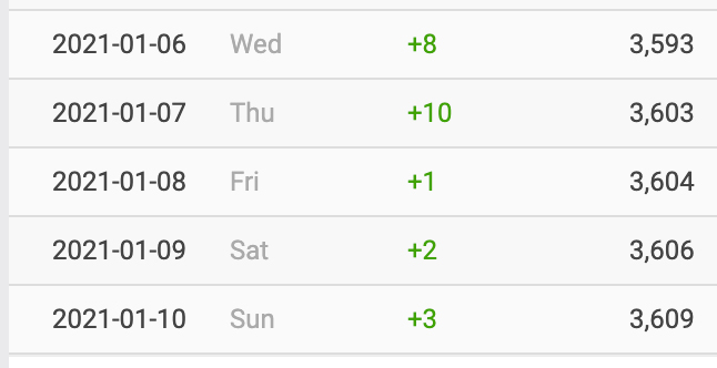
For reference, I had about 3,500 followers on Twitter when I launched my product. This is a respectable base and it certainly helped me to increase the buzz around my launch tweets.
I also found that launching on Product Hunt helped build my audience on Twitter, netting me 24 new followers over the span of five days.
Section 3 - Getting to the Top 5 on Product Hunt
So your product is now live on Product Hunt and it's taking off. People are upvoting it like crazy, you're getting retweeted left and right. Now what?
Post Performance
On launch day, Product Hunt gives you a launch dashboard to monitor your product's performance. The dashboard also shows you who's commenting on your post and makes it easy to reply (which you should do).
To access your launch dashboard, visit your product page. Look for the banner at the top of the page that contains a link to the dashboard.
From the dashboard, you'll be able to keep track of your leaderboard rank, which is partially determined by the number of votes your product has received. The algorithm also takes into account:
- Upvote source – Are people upvoting your product from the Product Hunt homepage (better) or directly from your product page link (not as good)?
- Comments, conversations and response rate – How much is the community engaging with the product? How active is the maker in responding to comments? Are replies and answers being upvoted?
- Website click throughs – How many people clicked the "Get it" button to visit your product?
- User profiles – Who is upvoting? (Long-standing accounts have more weight than first-timers.)
- And more – We don't know everything about the Product Hunt algorithm; instead we have to make assumptions based on the common characteristics of successful product launches.
Overall, the algorithm rewards makers who generate a "buzz". The more hype, activity, clicks and comments, the higher a product will rank.
Traffic and sales
When your product does well on Product Hunt, the first question is: how much traffic did you get? So, here are my stats, for reference.
Website: minimalicons.design (update 2025 - I've retired this site!)
Product Hunt launch date: January 6th, 12:01am PST
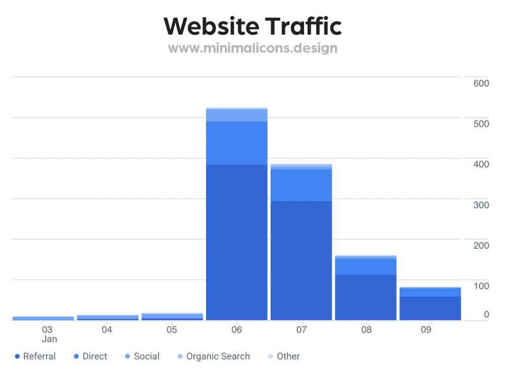
As you can see, there was a huge spike in traffic on the day of the launch (Jan 6th). Surprisingly, the traffic didn't drop back down to zero overnight, but instead has roughly halved every day since launch.
When we look at sales numbers, my best day was the day after launch:
Launch sales: $63
L+1 sales: $99
L+2 sales: $36
L+3 sales: $9
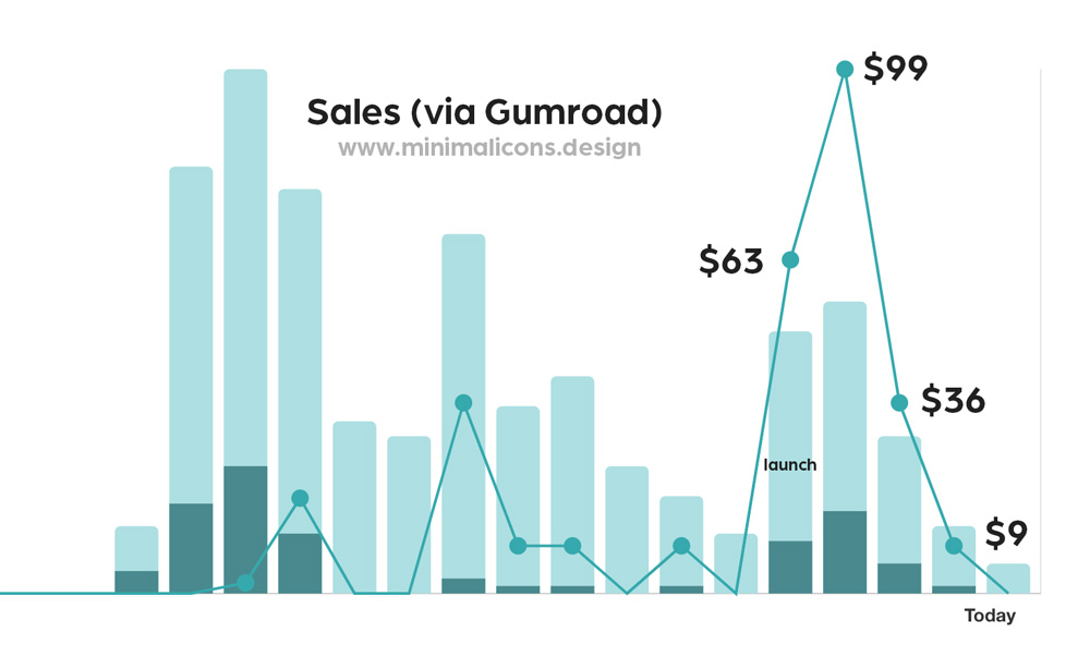
Not bad for a $9 pack of icons!
Finally, the launch resulted in an increased number of downloads of my free products (also hosted on Gumroad). This indicates that people clicked through to my Gumroad store to browse my other offerings.
Total downloads across all of my products:
Launch downloads: 36
L+1 downloads: 39
L+2 downloads: 17
L+3 downloads: 21
Product Hunt Scammers
On launch day, and for several days following launch, I received a handful of scam emails and Twitter DMs offering to boost my product up the leaderboard.
I can't believe anyone actually falls for these scams, but just in case, here's one of the emails so you can be on the lookout:
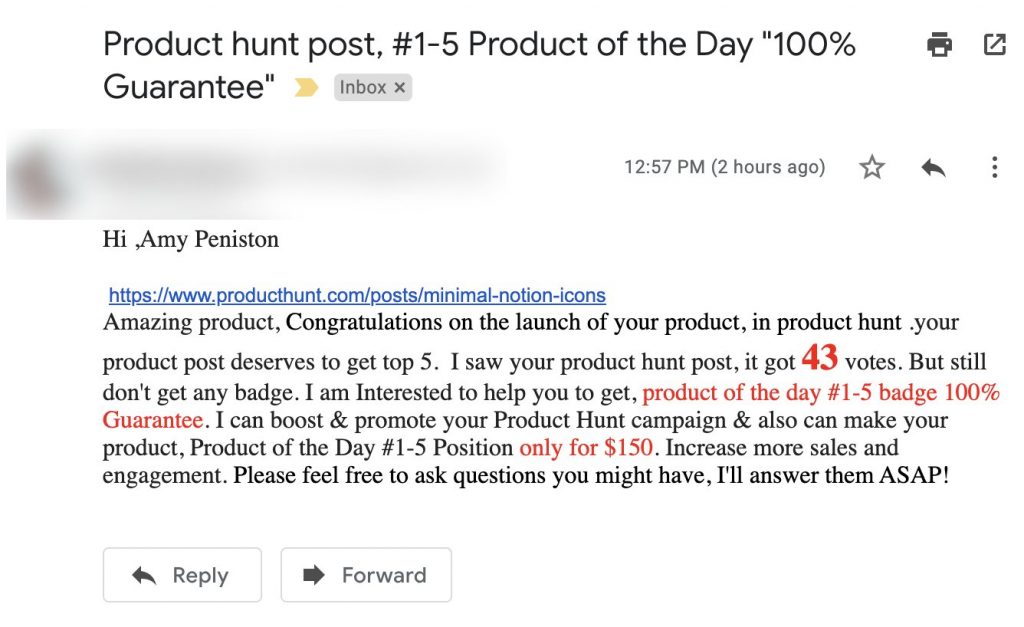
Another scammer contacted me by Twitter DM:
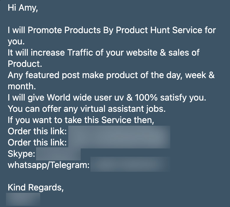
Obviously, paying for votes is very much against the Product Hunt community guidelines. And I suspect that their algorithm is very adept at sniffing out fake activity. So think twice before you wire money to some strange overseas bank account in exchange for that coveted #1 spot.
Invitations to SAAS Products
In addition to scams, my email and Twitter inboxes were flooded with invitations from founders to use various SAAS products. For example, a platform for better understanding your user base and a tool to notify your users of new feature releases.
I also received an email inviting me to showcase my product in a marketplace targeting other founders and creators.
Maybe I'm too grumpy for my own good, but my immediate reaction to these sorts of invitations is skepticism. In the end, I did not accept any invitations to try new products.
Getting Featured in Product Hunt's Newsletter
The day after launch, I received an email from Product Hunt to inform me that my product had been featured in their daily newsletter.
The Product Hunt Daily Digest goes out to tens of thousands of subscribers and contains the top 10 products from the previous day.
On January 7th, the day my product was featured in the digest, it had 180 votes. Today, four days later, it has 280 votes. It's hard to say where these 100 additional votes came from, but it's probably safe to assume that at least some of them came from the newsletter.
So, if you make it to the top 10, expect to see a second traffic spike the day after your launch when your product is displayed in the newsletter.

Product of the Day Badges
Regardless of how well your product does, you will get an embed code to include a "Featured On" badge on your website.
If you make it into the top 5, you will get a second embed code for a special "Product of the Day" badge.
Both badges are a form of social proof that can help potential customers to like and trust your product. Don't forget to include them on your website!
Product Hunt "Karma" Points
Just like Reddit and Hacker News, Product Hunt rewards users with points, which are displayed on your profile. Points aren't a currency and you can't trade them for anything; instead they represent your activity and success on the platform.
Multiple sources that I read suggested that these points impact the ranking algorithm. A few claimed that the votes of users with lots of points "count" for more than the votes of users with few points. In other words, the more points you get, the more clout you have.
You're Now a Maker!
Finally, posting on Product Hunt earns you the title, "Maker". This means that your comments will be labeled "Maker", distinguishing you from other commenters who have not yet contributed to the platform. You'll also get a green "M" badge on your profile picture.
Both the label and the badge draw attention to the fact that you have posted on Product Hunt. Welcome to the makers club!
Conclusion
Product Hunt is the internet's launch pad, offering excitement, discovery and potentially thousands of impressions. It can springboard products out of obscurity and into the limelight.
Product Hunt is also incredibly competitive and unpredictable. A successful launch one day might be a complete flop the next.
So, focus on the things you can control: the content of your product page, your scheduled launch date and the tactics you use to spread the word. Building an audience also helps, but is a longer-term strategy that shouldn't delay your launch.
With that, this post is a wrap! I hope you have a better idea of how to research, prepare and execute a successful Product Hunt launch. 🚀
Did I miss something? Tweet me: @amypeniston
Featured image created using photos by:
- Jae Park on Unsplash
- Dainis Graveris on Unsplash