Bermuda went into lockdown to slow the spread of COVID-19 on Saturday, April 4th. Lockdown was originally supposed to last for two weeks, however it was extended by an additional two weeks. On Saturday, May 2nd, the island finally started to re-open.
I was curious to know whether there had been any change in public sentiment as a result of the lockdown. It seems like a pretty obvious "yes", but I wondered whether I could utilize tweet data to show one way or the other.
What seemed like a simple question turned out to be less simple than expected for various reasons, which I will describe in more detail below.
The (free) Twitter Search API is far more limiting than I had realized.
Rate limiting of API calls means the number of tweets you can retrieve within a 15-minute interval is capped. This ended up not being a blocker, because it turns out that you can call the auth handler with instructions to "wait" in the event that rate limits are exceeded:
api = tweepy.API(auth, wait_on_rate_limit=True, wait_on_rate_limit_notify=True)
Then, because REST APIs are stateless, you need to keep track of the tweets that have been retrieved in order to maintain a search context across rate limit windows. To do this, pass the final tweet id of the previous batch into each successive call, effectively paginating the results.
On the free API tier, you are only able to retrieve tweets published within the last week.
This was the big bummer. I had made a few paginated requests as described above and was struggling to understand why the results were always truncated. I went back to the documentation, only to discover that Twitter restricts historical search functionality for free tier users.
I did some digging and found a few questionable scripts that attempted to bypass the historical search limitations, but, in the interest of maintaining a Twitter developer account in good standing, I opted not to go "black hat".
Assumptions
In an ideal world, I would be able to compile all tweets originating in Bermuda during the period of interest. Unfortunately, only a very small subset of tweets are geotagged (0.85% per day according to a 2015 study). While this might amount to a significant number of tweets on the macro scale, it would not provide sufficient data for the targeted subset of Bermuda-based users that I was interested in.
One thought was to use the "Location" field within users' profile pages. However, this data is not fetchable via the API, so I wouldn't be able to use it to compile a list of relevant users and monitor their tweets. Also, Location is a free-text field, meaning users can enter anything, ex: The Moon, Lost, etc.
So, for lack of a better option, I decided to search for all tweets containing the word "Bermuda". Poor proxy, I know, but a proof of concept nonetheless and easily attainable using the Twitter search API.
Process
I started my analysis in a Jupyter notebook hosted on Deepnote (jump in the beta while you can, it's awesome!).
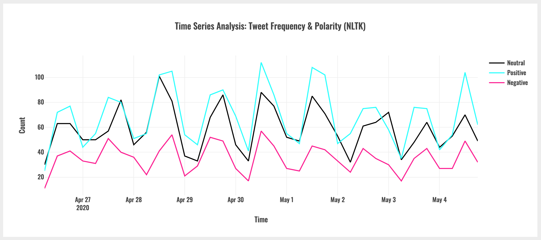
Using only seven days of tweet data was not ideal, but I decided to proceed with the analysis anyway. Luckily, my timing was spot on. I queried the search API for tweets on May 4th, which enabled me to capture data before and after the end of lockdown on the 2nd.
As mentioned above, I manually paginated successive API calls, excluding retweets using the -filter:retweets flag to maximize the amount of original content that was returned.
After fetching, exploring and cleaning the data, I utilized the TextBlob and NLTK sentiment analysis libraries to generate polarity scores for each tweet. This allowed me to observe whether there was any material difference in the sentiment results between the two libraries.
Within Jupyter, I then used the plotly library to generate interactive visuals.
Finally, I compiled the visuals into a dashboard web app using the dash framework and deployed it to Heroku.
Observations
Based on the time series plot of tweet count and polarity, above, there was no observable change in sentiment before and after the Bermuda lockdown was lifted on May 2nd.
However, as described earlier in the post, the gross assumptions I made in order to utilize the API significantly devalue this conclusion. Due to the fact that I was not able to rely on geotagging, the collected data are not representative of Bermuda-based tweets and therefore do not reflect public sentiment in Bermuda.
All is not lost. As a result of this analysis, I was able to make several more generalizable observations:
More subjective tweets tend to be more polarized.
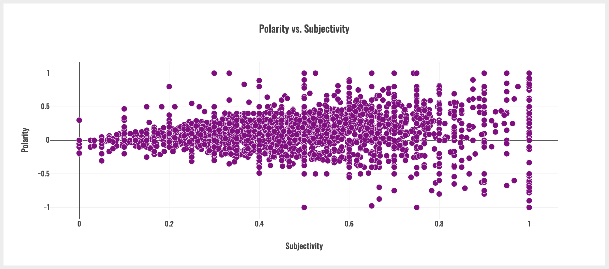
As seen above, as subjectivity increases, the range of polarity scores also increases.
TextBlob and NLTK polarity scores differ - sometimes significantly.
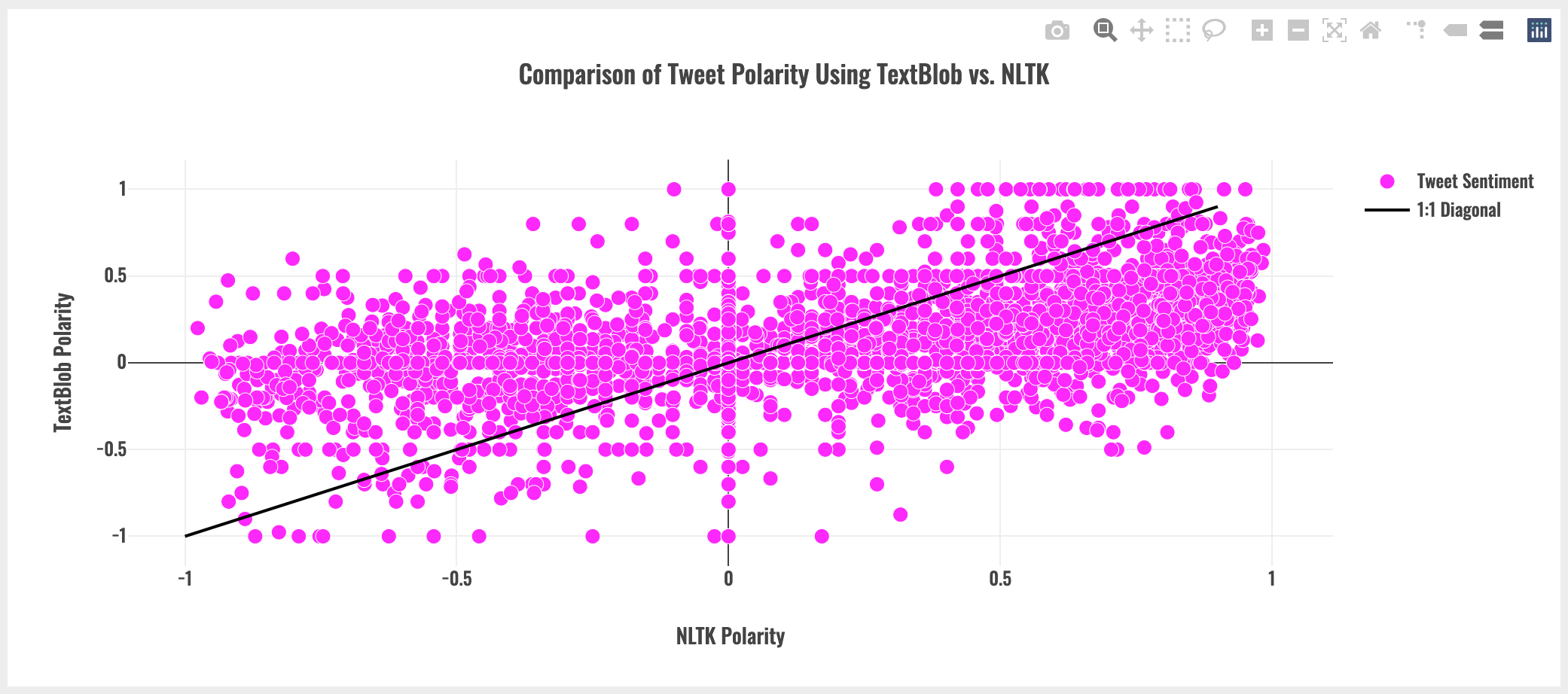
As seen above, with a 1:1 diagonal for reference, TextBlob and NLTK polarity scores can vary dramatically. For example, looking at the left hand side of plot, TextBlob appears to produce generally less negative polarity scores than NLTK. Note that this may be dataset-specific observation.
Conclusion
This was not a slam dunk, but it was an immensely valuable learning experience: grappling with the Twitter API, beta-testing Deepnote, figuring out plotly and then putting it all together in a dash web app hosted on heroku.
One possible next step would be to implement a custom sentiment analysis model. It would also be interesting to set up a real-time dashboard using the Twitter Streaming API.
Anyway, thanks for reading! Check out the links below for more: